Fonder: A Bold Sans Serif Display Typeface for Digital Impact
As a UI designer who ships landing pages, SaaS dashboards, and e-commerce experiences daily, I don’t reach for display fonts lightly. They need to earn their place—delivering clarity at scale, reinforcing brand voice without sacrificing usability, and performing flawlessly across devices. Fonder is one of the few modern sans serif typefaces that consistently checks all those boxes.
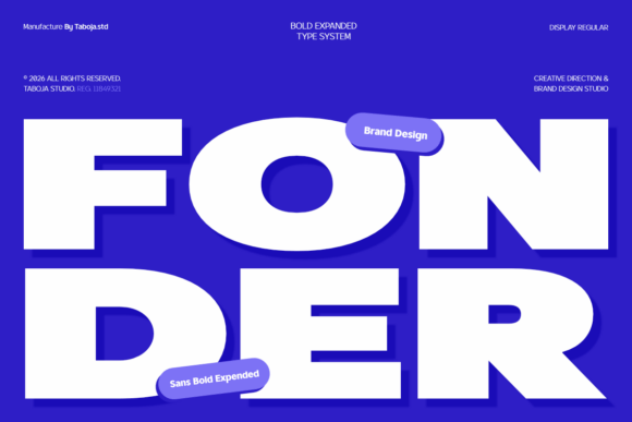
Fonder is built for presence—not decoration. Its wide proportions, confident geometry, and clean construction make it instantly legible at large sizes while retaining strong visual rhythm in tight layouts. Unlike condensed or overly stylized display fonts, Fonder avoids visual noise. It’s unapologetically bold, yet balanced—designed to anchor a layout, not distract from it.
Where Fonder Earns Its Place on Screen
In digital interfaces, typography isn’t just about aesthetics—it’s functional infrastructure. Fonder excels where hierarchy matters most:
- Hero sections and landing page headers: Its expanded width creates generous letter spacing and breathing room, even at 64px+ on desktop and 48px on mobile—no awkward kerning fixes needed.
- CTA buttons and promotional banners: On online stores or course sales pages, Fonder adds weight and urgency without shouting. Try it at 20–24px on primary buttons with ample padding—it scales cleanly down to 18px on iOS Safari.
- Branded section headings: For portfolio sites or agency case studies, use Fonder for “Work,” “Approach,” or “Impact” headers—pairing its authority with neutral body text keeps focus where it belongs.
- Logo lockups and short brand phrases: Because it’s designed with consistent stroke contrast and open apertures, Fonder holds up beautifully as part of SVG logos or inline text-based marks—even over textured backgrounds or subtle image overlays.
Readability & Responsiveness, Not Compromise
Fonder was engineered for screen-first use. Its x-height is generous, terminals are open, and counters remain clear—even at smaller display sizes. That means:
- On dark mode interfaces, Fonder maintains contrast without glare (test at #FFFFFF on #121212—it reads cleanly without needing extra letter-spacing).
- Over hero images with gradient overlays, it stays legible without heavy drop shadows—its geometry naturally resists visual bleed.
- In responsive navigation bars or sticky headers, Fonder works best at 28–36px on desktop, scaling down to 22px on tablet and 20px on mobile—always respecting viewport width and touch target size.
Avoid using Fonder for paragraph copy or data-dense UI elements like tables or form labels. It’s a display font—purpose-built for emphasis, not endurance. Reserve it for moments that define tone and guide attention.
Smart Pairings for Cohesive Digital Identity
Fonder thrives when paired intentionally. Its confidence calls for grounded, highly readable companions:
- With neutral sans serifs (e.g., Inter, Manrope, or system-ui): Ideal for SaaS apps, dashboards, and content-heavy sites. Fonder sets the headline; the body font handles scanning, accessibility, and long-form reading.
- With editorial serifs (e.g., Literata, Crimson Pro, or Lora): Perfect for blogs, newsletters, or creative studios wanting warmth and authority. The contrast between Fonder’s modern geometry and a refined serif adds depth without tension.
- Avoid pairing with other display fonts, script fonts, or decorative serifs—Fonder’s personality dominates. Let it lead; let the supporting type recede.
Practical Considerations for Real Projects
Fonder ships with multiple weights (Light through Black), true italics, and OpenType features including stylistic alternates and localized glyphs. It supports Latin Extended-A and includes multilingual punctuation—vital for global-facing sites or bilingual e-commerce stores.
Webfont delivery is optimized: WOFF2 files load fast, and variable font options (if available) reduce HTTP requests. Always declare font-display: swap in your @font-face rules—Fonder’s strong character means users won’t lose meaning during fallback.
Licensing matters. Fonder is a premium font—and its commercial license covers web embedding, client projects, SaaS platforms, online stores, digital templates, and branded assets. If you’re building a theme, template, or white-labeled product, verify the license tier permits redistribution. Never self-host or serve it via unauthorized CDNs.
When to Reach for Fonder—And When to Pause
Fonder shines in contexts where brand confidence and visual clarity intersect:
- A boutique skincare brand launching a new collection—Fonder on banner graphics, product name tags, and email headers communicates premium simplicity.
- A coaching website using a single-page layout—Fonder anchors each scroll-triggered section (“Clarity,” “Growth,” “Results”) while body text remains approachable and scannable.
- A digital course platform highlighting instructor names and module titles—its consistency builds trust across dozens of course cards and instructor bios.
- A creative studio’s portfolio site—used sparingly for project titles and category filters, Fonder reinforces craft without competing with imagery.
It’s less effective for micro-interactions (like tooltip text), dense dashboards (think analytics tables), or environments requiring high WCAG contrast ratios at small sizes. In those cases, fall back to your robust UI font stack—and keep Fonder reserved for moments that define the experience.
Typography in digital design isn’t about ornamentation. It’s about guiding eyes, shaping perception, and delivering message integrity across every device. Fonder does that—not by being everywhere, but by being unforgettable where it counts.